Case study: Pepsi's new logo and 3 lessons on (re)branding
)
Attend Technology for Marketing
Embodying a new identity
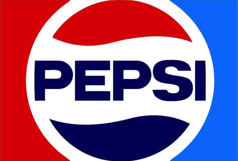
At the end of March 2023, Pepsi unveiled its new logo for the first time in 14 years, starting a new era for the brand. While the famous cola company stays true to its iconic red, white, and blue colours, the new visual identity is set on playing on a sense of nostalgia by simulating a logo that’s reminiscent of the 1970s to 1990s versions.

(Pepsi’s logo in the ‘70s. Image source: PepsiCo)
Modernising a brand through nostalgia may seem counterintuitive, but it can also be a powerful way to connect with consumers who crave the comfort of the past through their favourite brands.
“Their strongest branding since the 90’s”
Carl Stasiak, Director at thinklab UK and design expert states “The new logo is returning back to their iconic ‘70s look, with the white stripe flowing in a wavy formation through the circle. To me, it is their strongest branding since the ’90s. The addition of the bold, black font is a nod to their ’60s branding and combined gives a strong and very flexible rebrand bringing their old logos back in a fresher look.’
This new visual identity doesn’t exist in a vacuum. Indeed, it was crafted to support the new objectives of the brand. “The new design showcases a bold typeface, signature pulse and an updated colour palette, including the colour black highlighting the brand's commitment to Pepsi Zero Sugar” (PepsiCo, 2023)
The brand seems to want to move away from what is traditionally associated with sodas (sugar and unhealthy habits), and instead reinstates its commitment to providing fizzy drinks with no sugar, the whole thing in 100% recycled PET plastic bottles.
This goes to show that design and visual identity are an inherent part of being a brand, one that can have a huge influence on the products or services you’re selling.
Public reactions
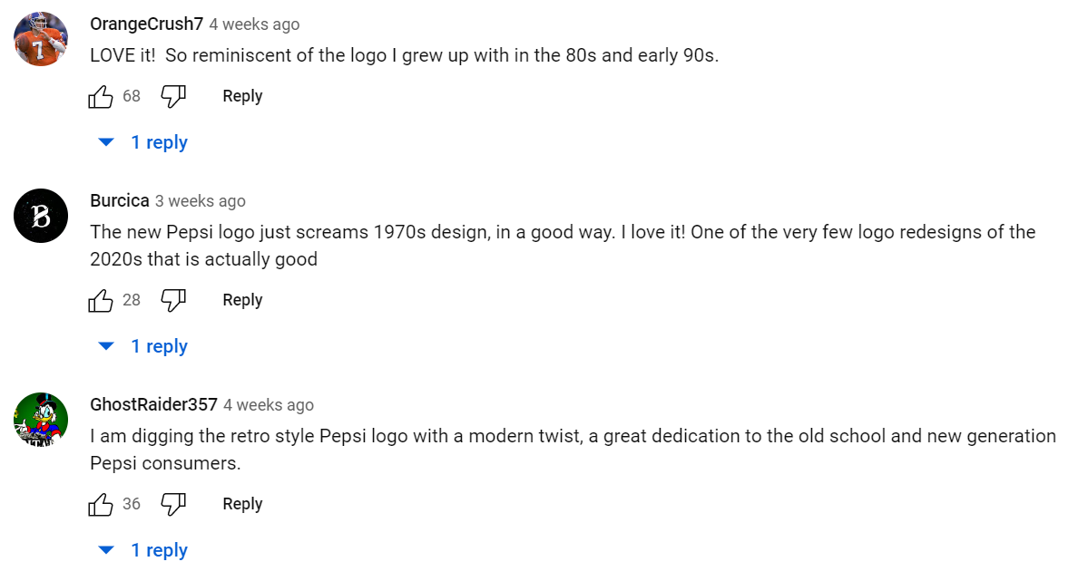
While reactions have been mixed on social media (it wouldn’t be the internet otherwise), a lot of people seem happy to see a legacy brand like Pepsi embrace its history. Bearing in mind that Pepsi has been around for decades, this is an opportunity for many who have been following the brand over the years to reconnect with a product that they love.

(Image Source: Youtube, under "New Logo and Visual Identity Announcement | Pepsi")
Learning from the past
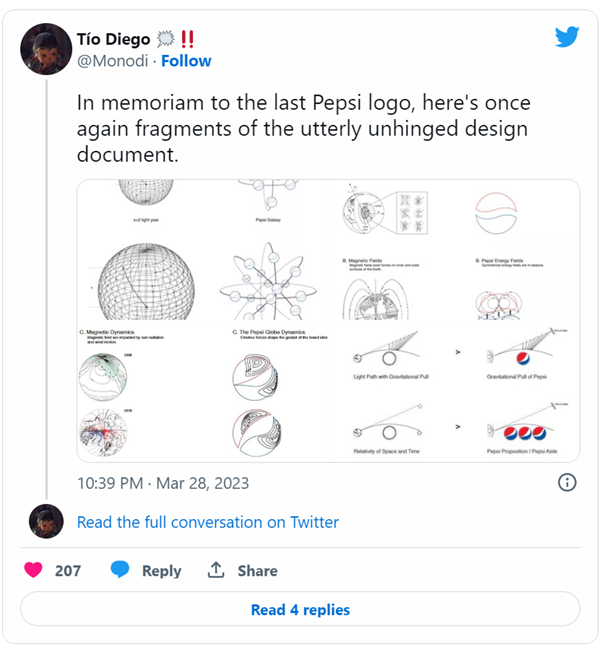
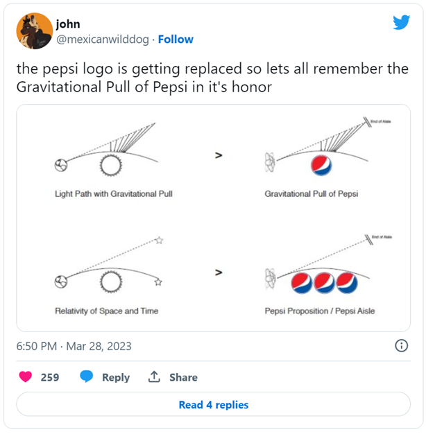
But Pepsi’s rebrands weren’t always so successful. In fact, in 2008, Pepsi unleashed one of the most unsuccessful logos in the history of the brand.
Part of the backlash the brand received on the 2008 logo was largely based on the document that detailed its creation process. On top of this, many felt that the logo was too simplistic and lacked the iconic and recognisable features of the previous Pepsi logos while disregarding the brand’s essence.
 |
 |
(Images source: Twitter)
3 key takeaways from Pepsi’s new rebrand
1. Listen to your audience and what they want
When most people are asked to draw the Pepsi logo from memory, they usually draw a circle, include the brand’s colours, and write the word Pepsi. “We couldn’t ignore that kind of insight, instead of rejecting it, we decided to embrace it.” (Mauro Porcini, PepsiCo’s chief design officer via CNN, 2023)
It’s obviously easier for a legacy brand like Pepsi to know exactly what consumers think of the brand because they are highly scrutinised. But for smaller businesses, it can be interesting to consult with an audience panel when making design decisions.
2. Make sure your visual identity reflects the objectives of your brand
In the case of Pepsi, they needed a new visual identity to reflect the fact that the brand was now going to focus mainly on zero-sugar products via the introduction of the colour black – reminiscent of their Pepsi Max line – to their main colour palette.
Investing in a good design and visual identity is important to help establish a recognisable and memorable identity with your consumers. Brand recognition is the first step toward brand loyalty.
3. Acknowledge the changes, and why you’ve made them, it’s part of your brand’s story
"At PepsiCo, we design our brands to tell a compelling and holistic story. Pepsi is a shining example of a brand that has consistently reinvented itself over 125 years to remain a part of pop culture and a part of people's lives," said Mauro Porcini, SVP & Chief Design Officer of PepsiCo. (PepsiCo, 2023)
Telling your story through visuals is just as important as telling your story with words. It sets you apart from competitors, makes your brand memorable, and can help create an emotional connection with your customers.
More marketing insights at Technology for Marketing:
Latest News
-
Ekwy Chukwuji on AI-Powered Branding, Scaling Equi Botanics, and the Next Era of Digital Marketing
27 Mar 2025Ekwy Chukwuji, founder of Equi Botanics, shares how she built an award-winning beauty brand, leveraged AI to scale her business, and became a thought leader in AI-driven marketing and automation. -
Your Month in Marketing and eCommerce: Consumer Confidence Trends, eCommerce Growth in Romania, and the Future of AI and Retail
27 Mar 2025 Alyssia Smith, Senior Content Manager at CloserStill MediaBite-size updates on what happened in marketing and eCommerce this month, to keep you ahead of the curve and inform your campaigns. -
Lauren Hannifan on Co-Founding Snug, Brand-Building, and Lessons in D2C Marketing
25 Feb 2025 Laura Dazon, Marketing ManagerLauren Hannifan, co-founder of Snug, shares how she built a standout D2C brand, disrupted the furniture industry, and created impactful customer experiences on a budget. Lauren's Career and Advice ... -
Technology for Marketing Introduces 2025 Advisory Board
25 Feb 2025 Laura Dazon, Marketing ManagerTechnology for Marketing is thrilled to announce the formation of our 2025 Advisory Board – a diverse group of marketing leaders committed to reimagining the future of marketing events. Led by our S ... -
January 2025 in Marketing: TikTok's US Comeback, Sweaty Betty's Global Push, and Google's AI Leap
27 Jan 2025 Lily Tokmantseva, Head of Marketing & Content - eCommerce Expo, Technology for Marketing and IMRGCatch up on this month's biggest marketing stories—TikTok's uncertain future in the US, Sweaty Betty's first global campaign, and Google's latest generative AI tools for retailers. -
Janis Thomas on Marketing for the Over-50s and Transforming eCommerce Strategies
27 Jan 2025 Laura Dazon, Marketing ManagerJanis Thomas, Managing Director at Look Fabulous Forever, on customer-centric marketing, eCommerce growth, and engaging the over-50s demographic for lasting success. -
Carolyn Tang Kmet: eCommerce Evolution, Data-Driven Teaching, and the Future of Personalisation in Marketing
30 Oct 2024 Laura Dazon, Marketing ManagerMeet Carolyn Tang Kmet, a seasoned expert in eCommerce and digital marketing turned educator at Northwestern University, as she shares insights on personalisation, data-driven marketing, and building ... -
Exhibiting at this year’s eCommerce Expo and Technology for Marketing was Greg Landon, Head of Marketing at lead conversion platform Leadoo, who we sat down with to discuss the most exciting trends he ...
-
Sam Heaton, CEO and Co-founder of direct mail platform Stannp.com to find out what valuable insights he gained from the shows and the major challenges eCommerce retailers will face ahead of peak shopp ...
-
Tjeerd Brenninkmeijer, Executive Vice President EMEA and Brand & Communications at eCommerce experience platform Bloomreach runs us through the best piece of advice he’d give newcomers in the industry ...

)
)
)
)
)
)
)
)
)
)
)
)

)
)
)
)
)
)
)
)
)
)
.svg)
)
