Case study: Pepsi's new logo and 3 lessons on (re)branding
)
Attend Technology for Marketing
Embodying a new identity
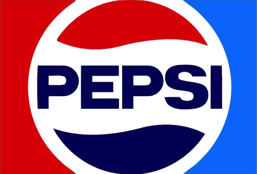
At the end of March 2023, Pepsi unveiled its new logo for the first time in 14 years, starting a new era for the brand. While the famous cola company stays true to its iconic red, white, and blue colours, the new visual identity is set on playing on a sense of nostalgia by simulating a logo that’s reminiscent of the 1970s to 1990s versions.

(Pepsi’s logo in the ‘70s. Image source: PepsiCo)
Modernising a brand through nostalgia may seem counterintuitive, but it can also be a powerful way to connect with consumers who crave the comfort of the past through their favourite brands.
“Their strongest branding since the 90’s”
Carl Stasiak, Director at thinklab UK and design expert states “The new logo is returning back to their iconic ‘70s look, with the white stripe flowing in a wavy formation through the circle. To me, it is their strongest branding since the ’90s. The addition of the bold, black font is a nod to their ’60s branding and combined gives a strong and very flexible rebrand bringing their old logos back in a fresher look.’
This new visual identity doesn’t exist in a vacuum. Indeed, it was crafted to support the new objectives of the brand. “The new design showcases a bold typeface, signature pulse and an updated colour palette, including the colour black highlighting the brand's commitment to Pepsi Zero Sugar” (PepsiCo, 2023)
The brand seems to want to move away from what is traditionally associated with sodas (sugar and unhealthy habits), and instead reinstates its commitment to providing fizzy drinks with no sugar, the whole thing in 100% recycled PET plastic bottles.
This goes to show that design and visual identity are an inherent part of being a brand, one that can have a huge influence on the products or services you’re selling.
Public reactions
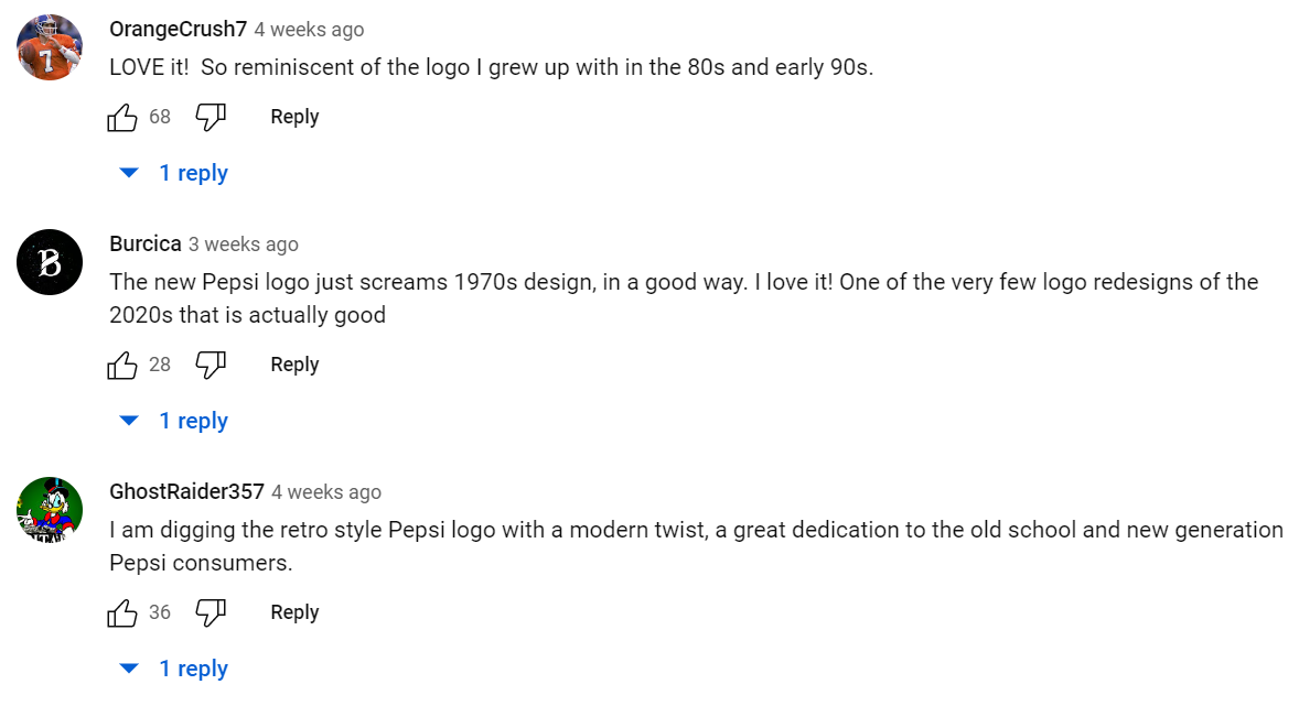
While reactions have been mixed on social media (it wouldn’t be the internet otherwise), a lot of people seem happy to see a legacy brand like Pepsi embrace its history. Bearing in mind that Pepsi has been around for decades, this is an opportunity for many who have been following the brand over the years to reconnect with a product that they love.

(Image Source: Youtube, under "New Logo and Visual Identity Announcement | Pepsi")
Learning from the past
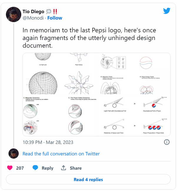
But Pepsi’s rebrands weren’t always so successful. In fact, in 2008, Pepsi unleashed one of the most unsuccessful logos in the history of the brand.
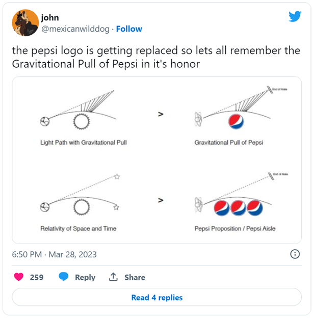
Part of the backlash the brand received on the 2008 logo was largely based on the document that detailed its creation process. On top of this, many felt that the logo was too simplistic and lacked the iconic and recognisable features of the previous Pepsi logos while disregarding the brand’s essence.
 |
 |
(Images source: Twitter)
3 key takeaways from Pepsi’s new rebrand
1. Listen to your audience and what they want
When most people are asked to draw the Pepsi logo from memory, they usually draw a circle, include the brand’s colours, and write the word Pepsi. “We couldn’t ignore that kind of insight, instead of rejecting it, we decided to embrace it.” (Mauro Porcini, PepsiCo’s chief design officer via CNN, 2023)
It’s obviously easier for a legacy brand like Pepsi to know exactly what consumers think of the brand because they are highly scrutinised. But for smaller businesses, it can be interesting to consult with an audience panel when making design decisions.
2. Make sure your visual identity reflects the objectives of your brand
In the case of Pepsi, they needed a new visual identity to reflect the fact that the brand was now going to focus mainly on zero-sugar products via the introduction of the colour black – reminiscent of their Pepsi Max line – to their main colour palette.
Investing in a good design and visual identity is important to help establish a recognisable and memorable identity with your consumers. Brand recognition is the first step toward brand loyalty.
3. Acknowledge the changes, and why you’ve made them, it’s part of your brand’s story
"At PepsiCo, we design our brands to tell a compelling and holistic story. Pepsi is a shining example of a brand that has consistently reinvented itself over 125 years to remain a part of pop culture and a part of people's lives," said Mauro Porcini, SVP & Chief Design Officer of PepsiCo. (PepsiCo, 2023)
Telling your story through visuals is just as important as telling your story with words. It sets you apart from competitors, makes your brand memorable, and can help create an emotional connection with your customers.
More marketing insights at Technology for Marketing:
Latest News
-
How To Write a B2B Marketing Strategy You Can Actually Deliver
10 Sep 2024 B2B Jade, TikTok Influencer and Founder - B2B Breakthrough AcademyIt sounds so simple, but the biggest reason most B2B companies don’t see results from their marketing efforts is that they aren’t working to a clear strategy with objectives, the right budget, and a s ... -
Zaria Parvez: Senior Global Social Media Manager at Duolingo – Creativity, Community, and Social Media Strategy
10 Sep 2024 Laura DazonMeet Zaria Parvez, the mastermind behind Duolingo's viral social media success, who grew their TikTok from 50K to over 11M followers. Discover how she transformed Duolingo into a social-first brand, c ... -
Jamie Crummie: Co-Founder of Too Good to Go – Fighting Food Waste One Meal at a Time
10 Sep 2024 Laura DazonMeet Jamie Crummie, co-founder of Too Good to Go, the app tackling food waste and now serving over 100 million users globally. In this interview, Jamie shares his journey, challenges, and vision for a ... -
We spoke with Amie Lane, Senior Manager, Partner and Field Marketing at referral marketing platform Mention Me on what she’s looking forward to seeing at this year’s eCommerce Expo and Technology for ...
-
Vanessa Mallia, Head of Growth at WeDoCRM, highlights AI-driven personalisation, omnichannel strategies, and key industry challenges ahead of eCommerce Expo and Technology for Marketing.
-
Oliver Shayer, Boots UK's Omni-Media Director delves into how brands can blend online convenience with immersive in-store experiences to create interactions that resonate with Gen Alpha.
-
Top 5 AI Tools for Productivity With Heather Murray
22 Aug 2024 Heather Murray, Founder of AI for Non-TechiesDiscover how these five AI tools can supercharge your personal productivity and free up hours in your day, whether you’re a solopreneur or simply looking to optimise your workflow.

)
)
)
)
)
)
)
)
)
)
)
)

