Case study: Pepsi's new logo and 3 lessons on (re)branding
)
Attend Technology for Marketing
Embodying a new identity
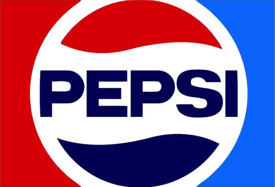
At the end of March 2023, Pepsi unveiled its new logo for the first time in 14 years, starting a new era for the brand. While the famous cola company stays true to its iconic red, white, and blue colours, the new visual identity is set on playing on a sense of nostalgia by simulating a logo that’s reminiscent of the 1970s to 1990s versions.

(Pepsi’s logo in the ‘70s. Image source: PepsiCo)
Modernising a brand through nostalgia may seem counterintuitive, but it can also be a powerful way to connect with consumers who crave the comfort of the past through their favourite brands.
“Their strongest branding since the 90’s”
Carl Stasiak, Director at thinklab UK and design expert states “The new logo is returning back to their iconic ‘70s look, with the white stripe flowing in a wavy formation through the circle. To me, it is their strongest branding since the ’90s. The addition of the bold, black font is a nod to their ’60s branding and combined gives a strong and very flexible rebrand bringing their old logos back in a fresher look.’
This new visual identity doesn’t exist in a vacuum. Indeed, it was crafted to support the new objectives of the brand. “The new design showcases a bold typeface, signature pulse and an updated colour palette, including the colour black highlighting the brand's commitment to Pepsi Zero Sugar” (PepsiCo, 2023)
The brand seems to want to move away from what is traditionally associated with sodas (sugar and unhealthy habits), and instead reinstates its commitment to providing fizzy drinks with no sugar, the whole thing in 100% recycled PET plastic bottles.
This goes to show that design and visual identity are an inherent part of being a brand, one that can have a huge influence on the products or services you’re selling.
Public reactions
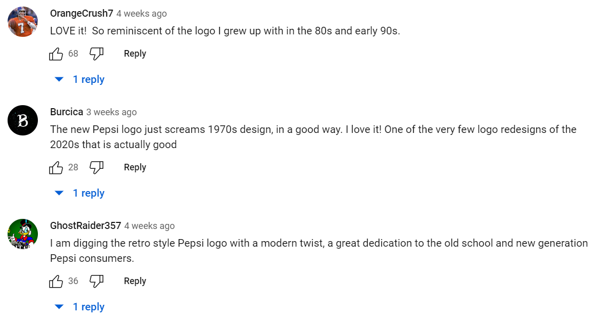
While reactions have been mixed on social media (it wouldn’t be the internet otherwise), a lot of people seem happy to see a legacy brand like Pepsi embrace its history. Bearing in mind that Pepsi has been around for decades, this is an opportunity for many who have been following the brand over the years to reconnect with a product that they love.

(Image Source: Youtube, under "New Logo and Visual Identity Announcement | Pepsi")
Learning from the past
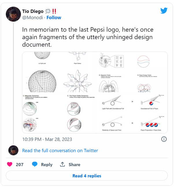
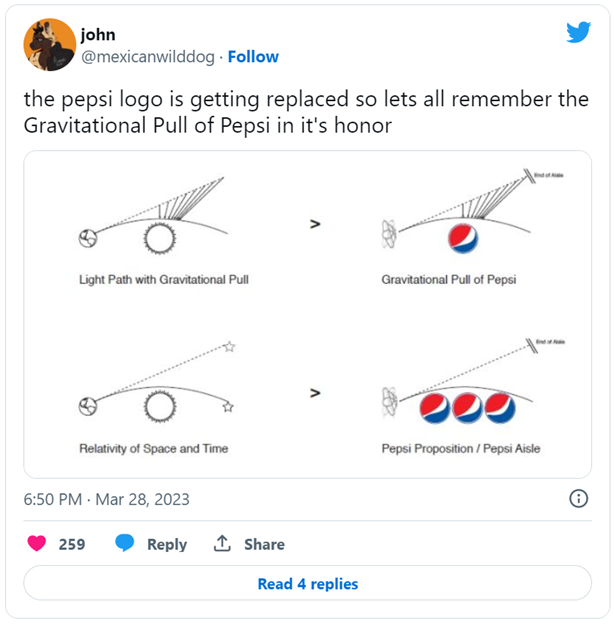
But Pepsi’s rebrands weren’t always so successful. In fact, in 2008, Pepsi unleashed one of the most unsuccessful logos in the history of the brand.
Part of the backlash the brand received on the 2008 logo was largely based on the document that detailed its creation process. On top of this, many felt that the logo was too simplistic and lacked the iconic and recognisable features of the previous Pepsi logos while disregarding the brand’s essence.
 |
 |
(Images source: Twitter)
3 key takeaways from Pepsi’s new rebrand
1. Listen to your audience and what they want
When most people are asked to draw the Pepsi logo from memory, they usually draw a circle, include the brand’s colours, and write the word Pepsi. “We couldn’t ignore that kind of insight, instead of rejecting it, we decided to embrace it.” (Mauro Porcini, PepsiCo’s chief design officer via CNN, 2023)
It’s obviously easier for a legacy brand like Pepsi to know exactly what consumers think of the brand because they are highly scrutinised. But for smaller businesses, it can be interesting to consult with an audience panel when making design decisions.
2. Make sure your visual identity reflects the objectives of your brand
In the case of Pepsi, they needed a new visual identity to reflect the fact that the brand was now going to focus mainly on zero-sugar products via the introduction of the colour black – reminiscent of their Pepsi Max line – to their main colour palette.
Investing in a good design and visual identity is important to help establish a recognisable and memorable identity with your consumers. Brand recognition is the first step toward brand loyalty.
3. Acknowledge the changes, and why you’ve made them, it’s part of your brand’s story
"At PepsiCo, we design our brands to tell a compelling and holistic story. Pepsi is a shining example of a brand that has consistently reinvented itself over 125 years to remain a part of pop culture and a part of people's lives," said Mauro Porcini, SVP & Chief Design Officer of PepsiCo. (PepsiCo, 2023)
Telling your story through visuals is just as important as telling your story with words. It sets you apart from competitors, makes your brand memorable, and can help create an emotional connection with your customers.
More marketing insights at Technology for Marketing:
Latest News
-
Unlocking the Power of AI in Marketing: Join the Masterclass on 25th April at Chelsea Football Club, London
23 Feb 2024In an era where technology is reshaping the marketing landscape, the role of Artificial Intelligence (AI) has become pivotal in driving business results. To delve into the intersection of AI and marke ... -
Creating Full Funnel Value: How Brands Can Utilise their Data to Personalise Content for Consumers
04 Feb 2024In a direct and insightful session, James Sharman and Ellie Webster from Haleon explored data-driven marketing strategies, focusing on the transformative power of personalisation in capturing the hear ... -
Building an AI-assisted Organisation and Augmented Marketing with Dragon's Den Piers Linney
04 Feb 2024Why does your company need both good customer experience (CX) and a successful customer journey? Aren’t they the same? Not exactly. Find out how to devise, and get management buy-in for your new custo ... -
Crumbs! How to Navigate a Cookieless Future
22 Jan 2024Envisioning a future without third-party tracking cookies raises crucial questions for data-driven marketing. Marketers face significant challenges in reimagining customer acquisition strategies. Yet, ... -
Trends were once the purview of the press and the brands that paid them. Now, social media has laid waste to this top-down approach to popular culture and consumers have taken much of the power back, ...
-
Take a peek into the future with this presentation about the challenges that digital marketers will face, and how to address them today, with Dimitrios Rokos, Chief Commercial Officer of WayMore. Key ...
-
The Marketing Gold Rush: Capitalising on personalisation and structured data with PIMcore
10 Jan 2024As competition within marketing channels becomes fiercer, numerous firms are overlooking an essential resource: their existing structured data. This talk shed light on the frequently underestimated op ... -
Claire Ferreira, Founder and Chief Marketing Officer of "Mums in Marketing," shared key insights into the transformative power of digital communities for brands and retailers during her conference at ...

)
)
)
)
)
)
)
)
)
)
)
.png/fit-in/500x500/filters:no_upscale())

